The prolific and beloved writer, Stephen King, said: “Fiction is the truth inside the lie.” For some of us, fictional stories are pure entertainment, while for others, they are an imaginative journey into a future that could become a reality. Some of us believe this because amazing things have happened that were once fiction.
One of these fictional stories is the popular TV series, Snowpiercer. If you have not tuned in, it’s about a future where a failed climate-change experiment has destroyed all life except for those who have boarded the Snowpiercer, a train that perpetually travels around the globe. According to the storyline, the entire world is in a deep ice age by 2031, and for those on the train, a new class system emerges. You might believe this is the closest humanity and civilization will ever get to an ice age, but the earth’s climate history provides the truth in this lie.
Surprisingly, you only need three graphs (actually one expanded into three parts) to appreciate a portion of the earth’s climate history. The graphs are based on data collected and analyzed by many dedicated scientists over decades. The data come from deep ice cores in Antarctica and Greenland, worldwide deep ocean sediment cores, and even the interiors of prehistoric caves. More recent data, accumulated over the last 150 years, has utilized many different methods to estimate the earth’s average global temperature.
There is considerable consistency across all these different data sets. This consistency provides reasonable assurance that the estimates of the earth’s temperature over millions of years are likely correct. The data sets indicate that there were many ice ages in the past, and they occurred with some regularity. The data also suggest that over its geologically recent history, the earth has spent much more time at colder temperatures than it has in warm ones. Civilization, as we know it today, would not survive another ice age. Very low temperatures result in death, destruction, the extinction of species, and mass migrations. During such an event, the safest place to live is on and around the earth’s equator.
The earth’s climate history indicates what goes up in temperature will eventually come down. The principal uncertainty today is when will the warm temperatures we experience today come down. No one knows, nor can anyone predict when the descent into colder temperatures will begin. The many climate models being used to provide future climate forecasts cannot tell us when this will happen. We just know that it will very likely occur based on the earth’s climate history.
The three related graphs that describe the earth’s climate history over the last 800,000 years are described sequentially below.

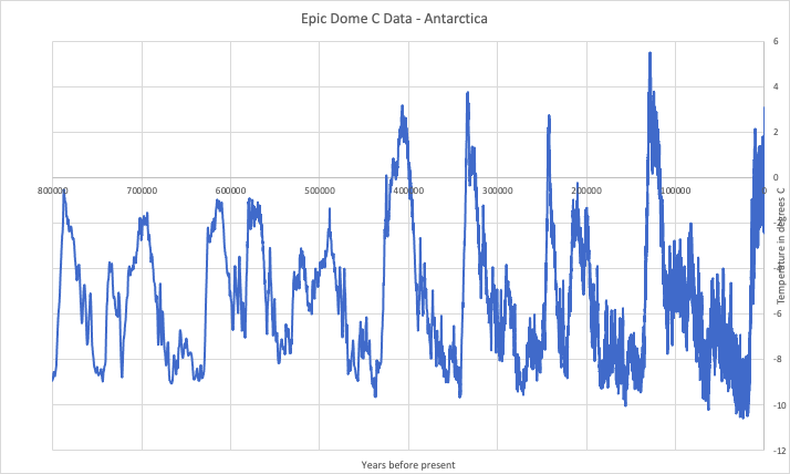
The first graph above has essential information related to the earth’s temperature history. The temperature on the vertical axis is measured in degrees Celsius (C) relative to today’s average of 15 degrees C. The average temperature during this entire period was about 10 degrees C or 5 degrees C lower than today’s average. The lowest average temperature during this period was about 5 degrees C or 5 degrees above freezing.
The horizontal time axis in this graph is significantly compressed because it extends back 800,000 years. This compression makes some of the temperature peaks look very sharp: however, the width of these peaks contains information about how long warm periods last. As will become apparent, warmer periods are relatively short compared to colder periods.
The second graph above (labeled B) is an expansion in time of the rightmost part of the first graph. This section describes the earth’s temperature over the last 11,000 years or so. It indicates an overall decline in temperature from a peak about 9,000 years ago to the lower temperatures we experience today.
And the third graph above similarly expands the rightmost portion of the second graph. It describes the earth’s temperature over the last 145 years. The black lines indicate cyclical up and down temperature trends over relatively short periods of 30 to 40 years.
The key feature of the first graph is the relatively sharp peaks in temperature. Depending on how you count them, there are 10 to 13 such peaks. Four of them extend above 15 degrees C, and all of them are above today’s purported average global temperature. The most recent peak about 130,000 years ago is nearly 5 degrees C above today’s average temperature.
By cutting the tops off the four prominent peaks with a horizontal axis at today’s average temperature, one can get an estimate of how long warm periods have lasted. The duration ranges from about 3,000 to 22,000 years. In comparison, the peak we are on now has lasted for roughly 10,000 years. These warm periods are relatively short compared to the colder periods lasting between 70,000 to 90,000 years. The lowest temperature of the last ice age, about 5 degrees C, spanned around 9,000 years. This low temperature ended about 17,000 years ago by temperature increases that eventually, after reaching a peak, declined over 9,000 years to the cooler temperature today.
No one knows when the current warm period will end because no one understands the conditions that would tip the earth into descending temperatures. Based on the first graph, once the descent begins, it continues through a negative feedback loop over time that eventually bottoms out at very low temperatures. As the earth tips into colder temperatures, more snow and ice accumulate on the vast northern land areas, which causes more sunlight reflected into outer space. This reduction in energy retention cools the earth, but warm moist air from around the equator collides with the cold air from the north and south to produce more snow and ice. This cyclical process continues until it is so cold that there is very little moisture left in the air to make snow and ice.
The second graph also has a wealth of information. Visually there appears to be a long-term downward trend in temperature along with many short-term ups and downs over 11,000 years. Based on known physical processes, there are good reasons to believe that the downward trend in temperature has been impacting the earth’s climate over the last 9,000 years.
A way of explaining this is through a set of questions. Why does the earth always come out of regularly occurring ice ages? What causes the massive amounts of ice and snow to melt toward the end of an ice age? What source of energy melts the ice and snow? Why doesn’t the earth’s temperature continue to increase after much of the snow and ice have melted?
The answer to these questions involves naturally occurring changes in the sun’s illumination of the earth. On rare occasions, three things happen synchronously to cause the earth’s temperature to increase over thousands of years. This phenomenon occurs when the earth comes closest to the sun, the tilt of the earth’s axis is at a maximum angle, and the earth’s axis of rotation tilts toward the sun. Under these conditions, the northern latitudes receive maximum sunlight over thousands of years. This synchronization started to develop about 17,000 years ago and ended at a peak temperature about 9,000 years ago. After that time, the angle of the earth’s axis decreased to about half the maximum angle observed today. This decrease in angle reduces the amount of sunlight received at northern latitudes, expanding the northern region where cold air accumulates. This region also contains the polar vortex. The substantial loss in the sun’s energy at northern latitudes is the likely cause of the overall cooling trend over the last 9,000 years, which will continue.
The second graph also has many ups and downs, including those indicated at the graph’s far rightmost portion. These temperature swings are associated with “the little ice age,” which is a low temperature trend with ups and downs that lasted about 600 years. However, given the many rapid temperature excursions over 11,000 years, there appears to be nothing special about them except for the lower temperatures.
The rise in temperature after “the little ice age” is expanded in the third graph from the left. There are cyclical cooling and warming trends that lasted about 30-40 years. These trends have happened before, as shown in the second graph. Despite the overall upward trend over the last 145 years, the second graph indicates that the dominant climate trend over the last 9,000 years is cooling. Imagine living in each of the 30-40-year cycles (about half a lifespan) and believing that the trend will result in a freezing or warming catastrophe. No one lives long enough to experience a 9,000-year trend!
So, where does this leave the fate of the earth? No one seems to know. You would think that the models that climate scientists use to predict average global temperatures well into the future would have something definitive to say about a catastrophic effect such as an ice age. However, ice ages remain unexplained. There is no predictive theory of the earth’s climate that explains their occurrence and behavior.
By now, it should be clear that climate models in current use are inadequate and unreliable. There are deficiencies in our understanding of climate that must be addressed before making scientific judgments about the future of the earth’s climate. Based on saving civilization from the next ice age, I cannot think of a more critical scientific research problem facing humanity. Can you?


Go here, https://wattsupwiththat.com/2022/10/01/what-is-milankovitch-theory-what-is-it-not-and-what-can-we-learn-from-it/
https://wattsupwiththat.com/2022/10/01/what-is-milankovitch-theory-what-is-it-not-and-what-can-we-learn-from-it/
Go here, https://wattsupwiththat.com/2022/10/01/what-is-milankovitch-theory-what-is-it-not-and-what-can-we-learn-from-it/
Please tell me more about this. May I ask you a question?
What is your question?
This curve is just more modeling of data to get the answer you like. What was wrong before?
The more important question is why are there recurring periods of cooling and warming trends lasting 30-40 years as indicated in the essay over the last 145 years while CO2 was increasing?
You need to explain this in terms of known and measured physical effects to justify or negate the CO2 hypothesis.
Very Interesting writing, John. The Prediction Problem of Global Air Temperature is surely a serious Challenge. The high uncertainty of the Phenomenon must be clearly recognized. The question remains if the anthropic influence has been a significant factor since the initiation of the Industrial Time.
I am skeptical that we even know the average global temperature to an accuracy of 1 degree C or the rate of increase.
AOC wouldn’t agree with you and she was a bartender! Good info, thanks!